C# GUI with WPF – Using Group boxes
A short UI development post today following some work I’ve completed on building a new GUI for a project at work. Hopefully this post gives a brief introduction to those wanting to also use group boxes to group content, and how to resolve the issue where using group boxes may give you the error “The property ‘Content’ is set more than once.”.
What is a group box?
A group box is a UI (user interface) control for grouping other UI controls together. This can be used to visually guide the user and give them confirmation that a set of controls all belong to the same action. An example of this can be seen below.
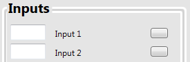
Example group box grouping inputs
Group boxes give the benefit of being able to give titles to them that overlay their borders. This is easier than faffing around with normal borders and adding labels in the right place.
Using a group box (for one item)
Using a group box is nice and easy and follows normal XAML practice. The group box control is added with the “GroupBox” name and you can add several attributes to it as you would with any other control. An example is seen below.
<GroupBox>
    <Label Content="MyLabel" HorizontalAlignment="Left" VerticalAlignment="Top" Margin="0,0,0,0" />
</GroupBox>
Adding a header to the group box is easily done by adding the “Header” attribute (as seen below).
<GroupBox Header="MyTitle">
    <Label Content="MyLabel" HorizontalAlignment="Left" VerticalAlignment="Top" Margin="0,0,0,0" />
</GroupBox>
Error “The property ‘Content’ is set more than once”
When adding content to a group box, you need to be wary of how the group box is working otherwise you might get the error “The property ‘Content’ is set more than once”.
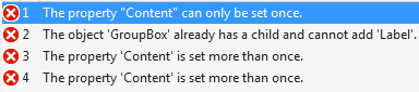
Example compilation errors when adding multiple labels to a group box area
Luckily, fixing this error is very simple if you understand one key concept of the group box – it only accepts one child component. That is, it will only accept one other UI control inside its area with the content property. So you can’t set two labels in a group box.
<GroupBox Header="MyTitle">
    <Label Content="MyLabel" HorizontalAlignment="Left" VerticalAlignment="Top" Margin="0,0,0,0" />
    <Label Content="AlsoMyLabel" HorizontalAlignment="Left" VerticalAlignment="Top" Margin="0,0,0,0" />
</GroupBox>
This won’t work – don’t try this!
Using grids inside the group box
To resolve the issue of the group box not accepting multiple child components, you can set a child component within the group box which can then itself accept multiple child components. An easy way to do this is to use the grid control. Add a grid control to the group box and you can then add multiple controls to the grid as you would normally and the group box won’t complain.
<GroupBox Header="MyTitle">
    <Grid>
        <Label Content="MyLabel" HorizontalAlignment="Left" VerticalAlignment="Top" Margin="0,0,0,0" />
        <Label Content="AlsoMyLabel" HorizontalAlignment="Left" VerticalAlignment="Top" Margin="0,0,0,0" />
    </Grid>
</GroupBox>
This will work – give it a try.
The grid component will accept multiple children which become grandchildren components to the group box. But to the group box, it only has one child and so it’ll compile happily and run, allowing you to set multiple controls within the group box area.
Hopefully you now won’t have any trouble grouping controls for sleek GUI designs, but if you do feel free to give me a shout in the comments if Google/Stack Overflow can’t solve your issue.
About Author
FraserG
Computer Scientist currently undertaking an Engineering Doctorate degree discussing computing, programming, research and racing.